ABCDEFGHIJKLMNOPQRSTUVWXYZ
Aleksei
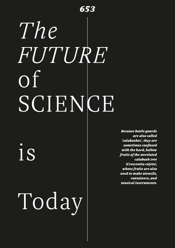
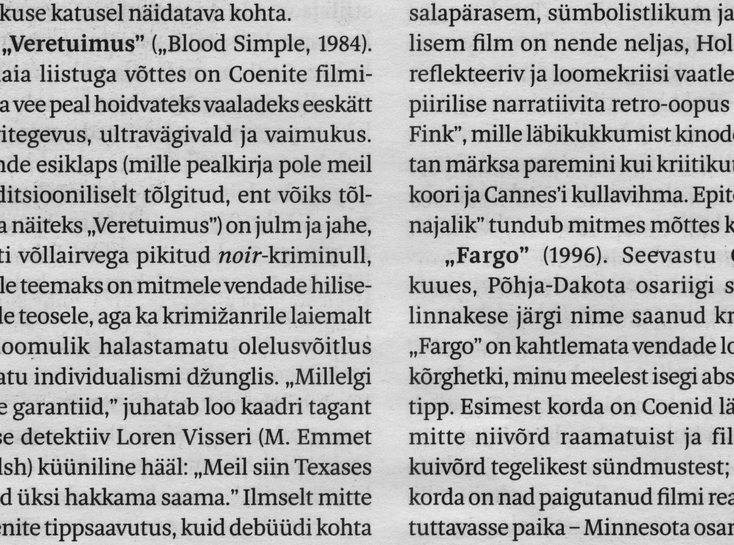
Aleksei is a serif typeface inspired by circular movements. These are reflected in rotated contrast, rotating inkdrops and other round shapes. The contrast of the typeface has been carefully adjusted for long running texts to perform well in small sizes, resulting in a regular weight with moderate contrast and solid thin strokes.
Since the first versions of Aleksei were drawn before Adam, both typefaces grew complementary to each other. Their proportions and weights fit well together.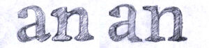
Aleksei cuts
Thin
Thin Italic
Regular
Regular Italic
Bold
Bold Italic
Black
Black Italic
Uppercase
Lowercase
abcdefghijklmnopqrstuvwxyz
Small Caps
ABCDEFGHIJKLMNOPQRSTUVWXYZ
Cyrillic Uppercase
АБВГДЕЁЖЗИЙКЛМНОПРСТУФХЦЧШЩЪЫЬЭЮЯ
Cyrillic Lowercase
абвгдеёжзийклмнопрстуфхцчшщъыьэюя
Numbers
0123456789
Oldstyle Figures
0123456789
Superscript
0123456789
Ligatures
fi fl ff fj fb ffl
Aleksei Collection
8 styles
€300.00€560.00
Individual styles
- Aleksei Thin€70.00
- Aleksei Thin Italic€70.00
- Aleksei Regular€70.00
- Aleksei Regular Italic€70.00
- Aleksei Bold€70.00
- Aleksei Bold Italic€70.00
- Aleksei Black€70.00
- Aleksei Black Italic€70.00
In use
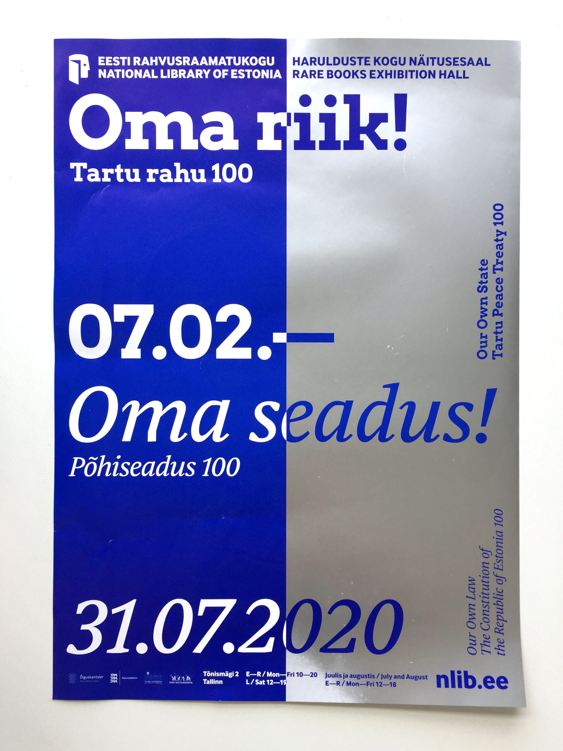
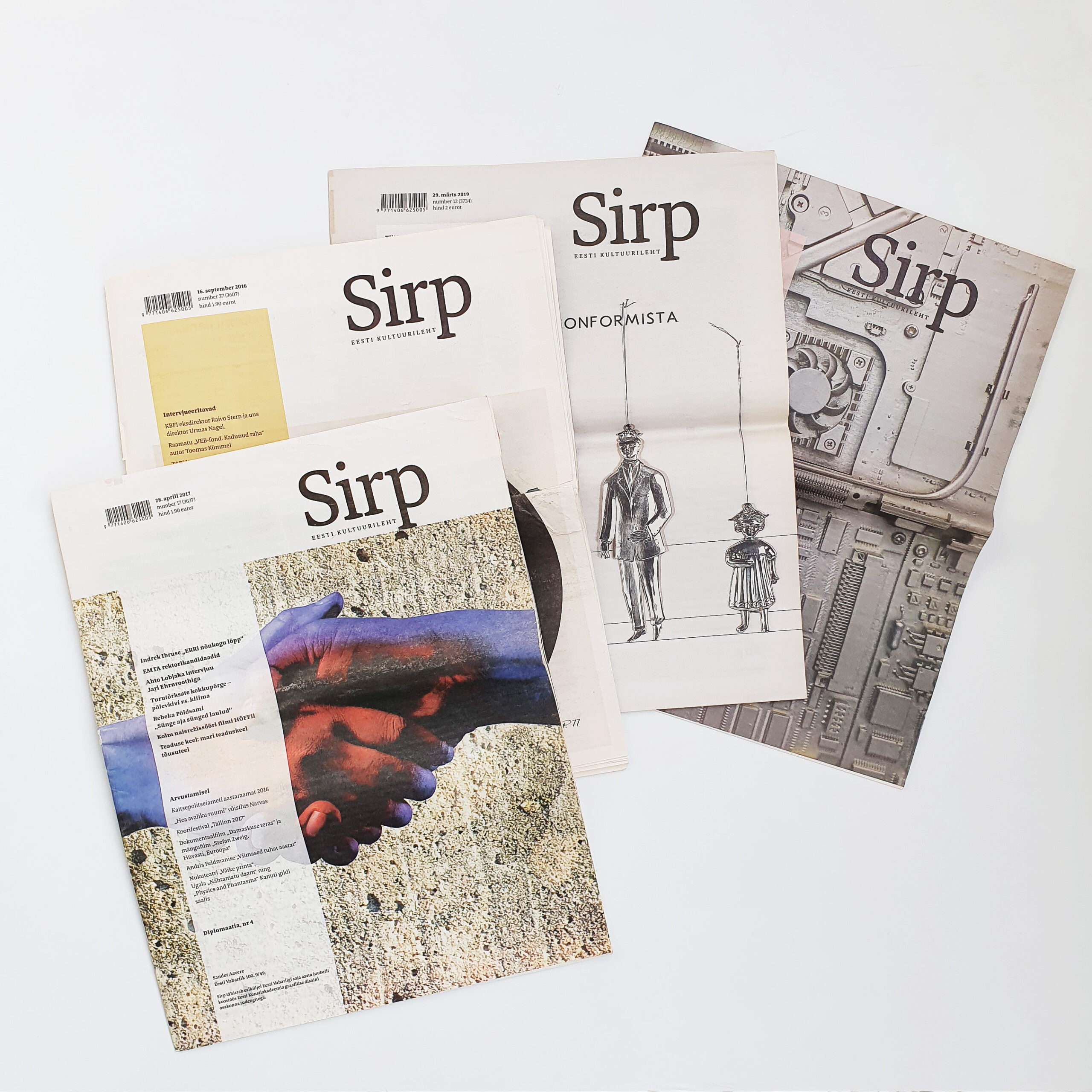
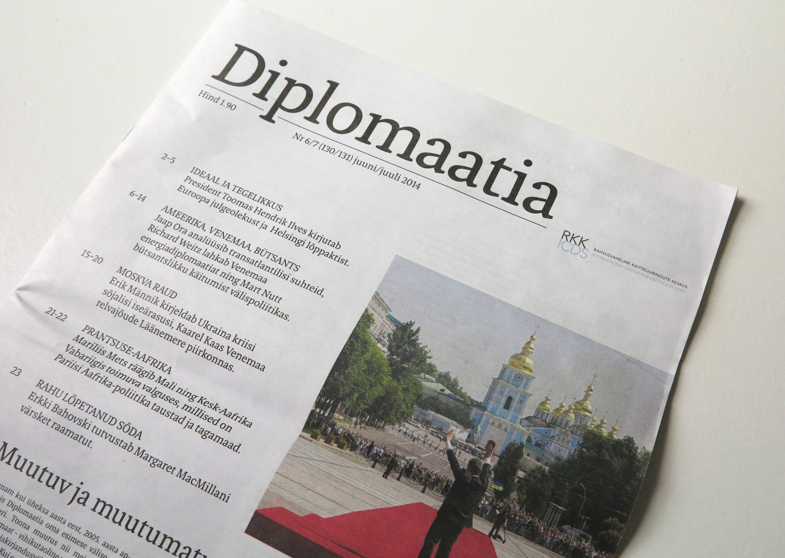
Sirp weekly culture newspaper. Estonia
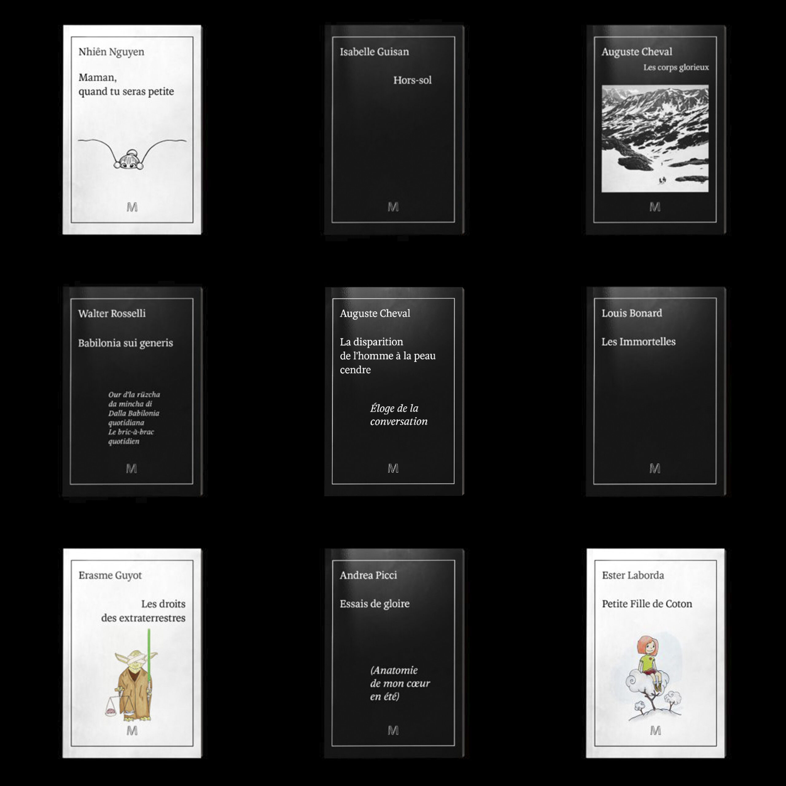
Editions-Marquise. Lausanne
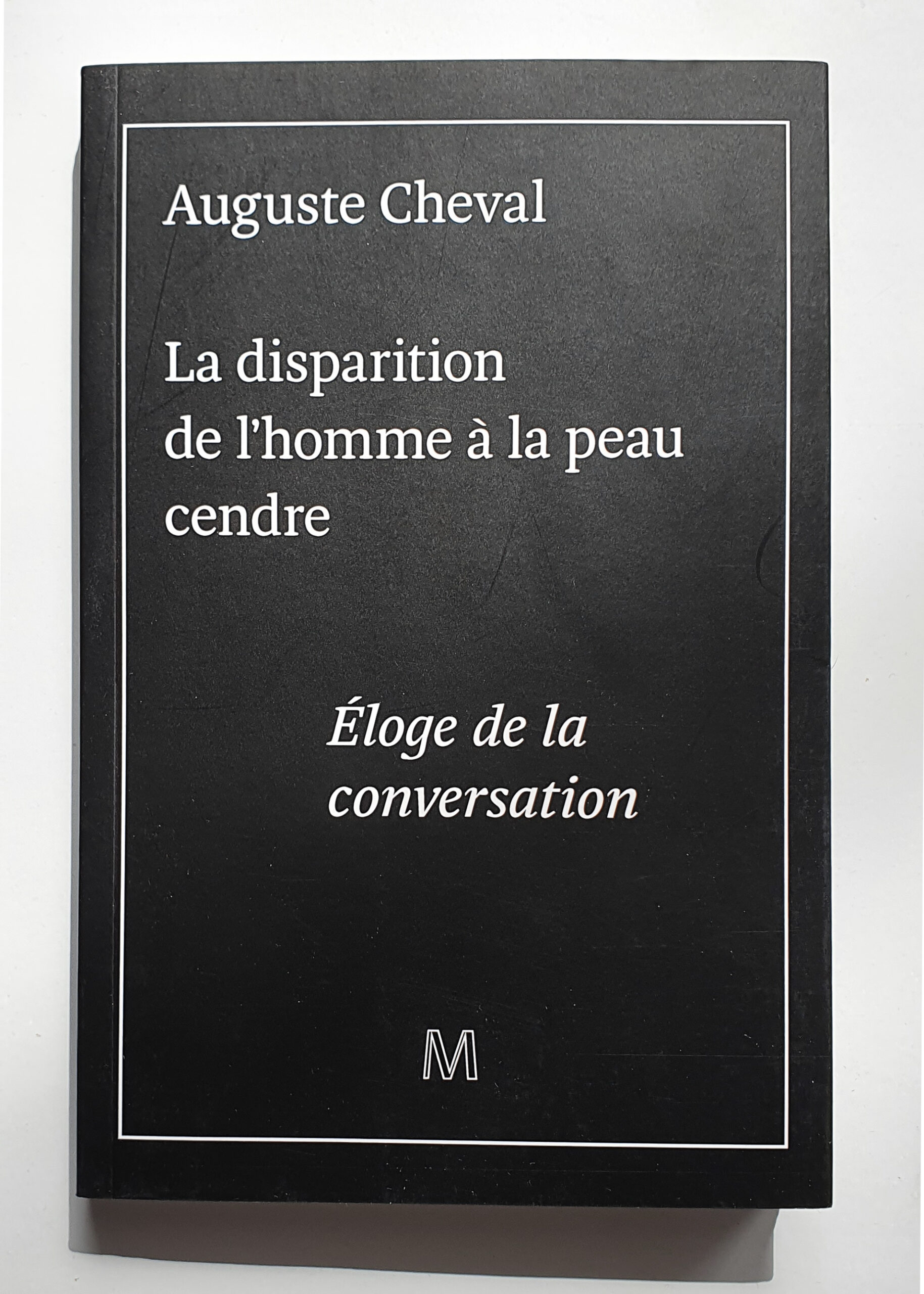
La disparition de l’homme à la peau cendre – Eloge de la conversation. Design by Chris Gautschi
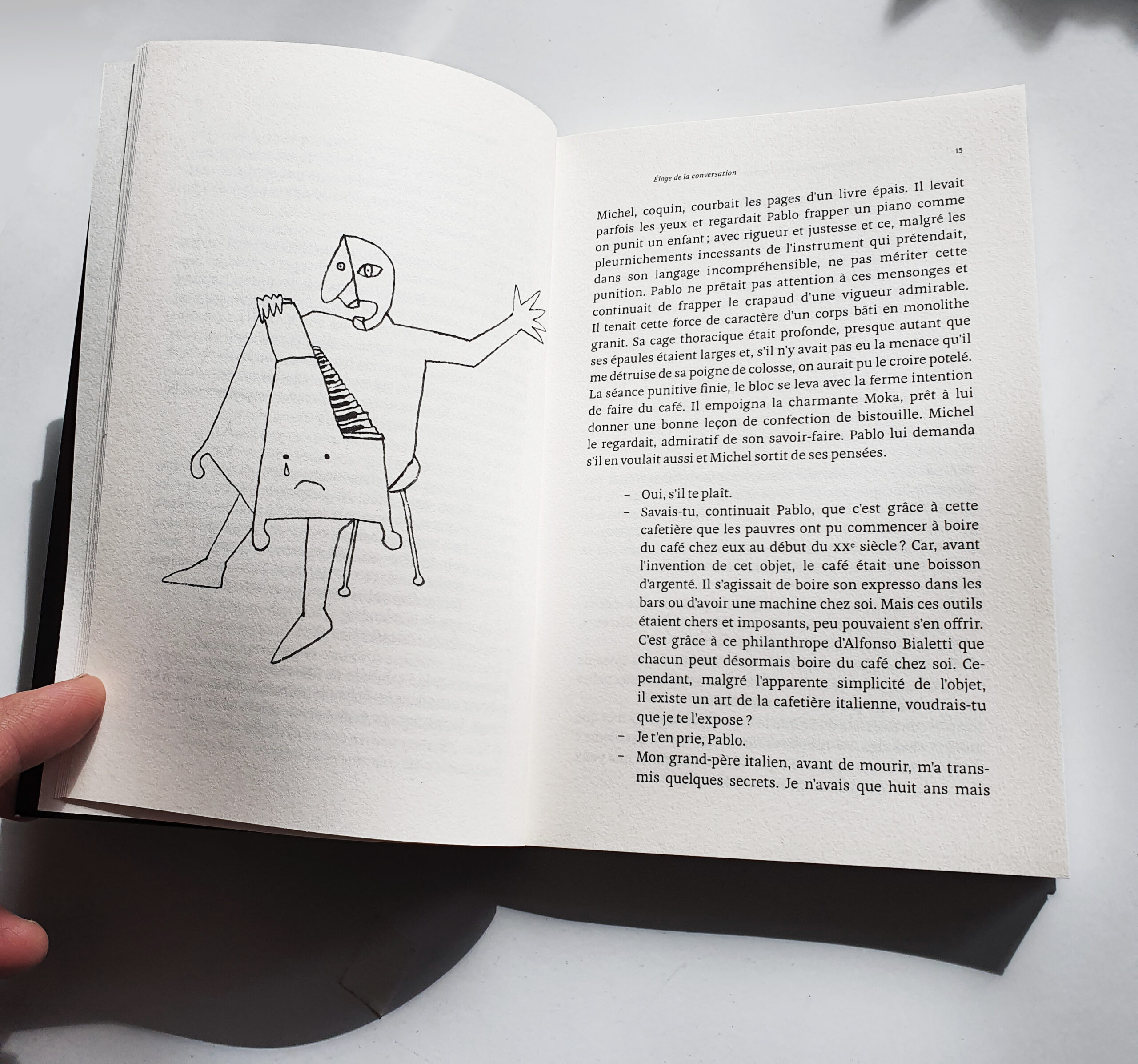
La disparition de l’homme à la peau cendre – Eloge de la conversation
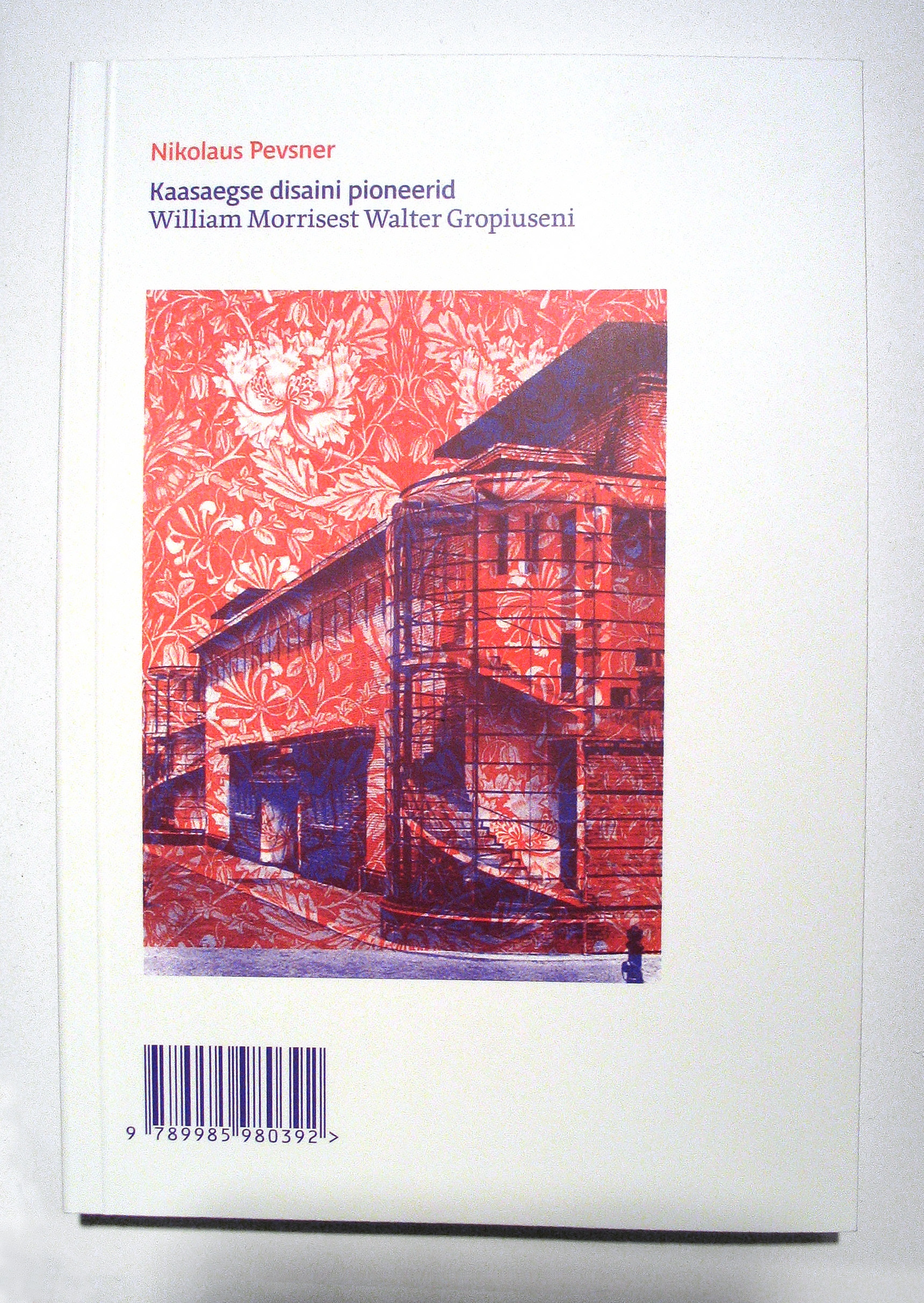
Nikolaus Pevsner “Kaasaegse disaini pioneerid William Morrisest Walter Gropiuseni”